Starting a website is one of the best things you could do for your business. A website will make sure that your work gets seen by more people and will allow you to create a first impression that lasts. However, if someone has a bad experience on your site, they’re likely to leave it and stumble across your competition instead. In this article, I’m going to talk about what you should and shouldn’t do on your first website.
What You Should Do
First of all, let’s cover the good practices you should follow for a better site.
Make A Snappy Slogan
Making sure that your website and your content stick in a consumer’s head is the best way to ensure that consumers will come back to see your work again. If you make sure to have a catchy, easy-to-remember slogan on your website, you can be sure you’ll be remembered. That’s one of the best ways you can make sure your brand has a better chance of bringing in recurring visitors.
An example that proves this is radio jingles. I’m sure you’ll be able to remember a radio jingle that played in your home town when you were younger, I know I can. The power of language is yours to use in this way, you can make sure people remember you and come back repeatedly to see your content, as long as you make sure to have a hook present on your page. What could be a better hook than a snappy slogan?
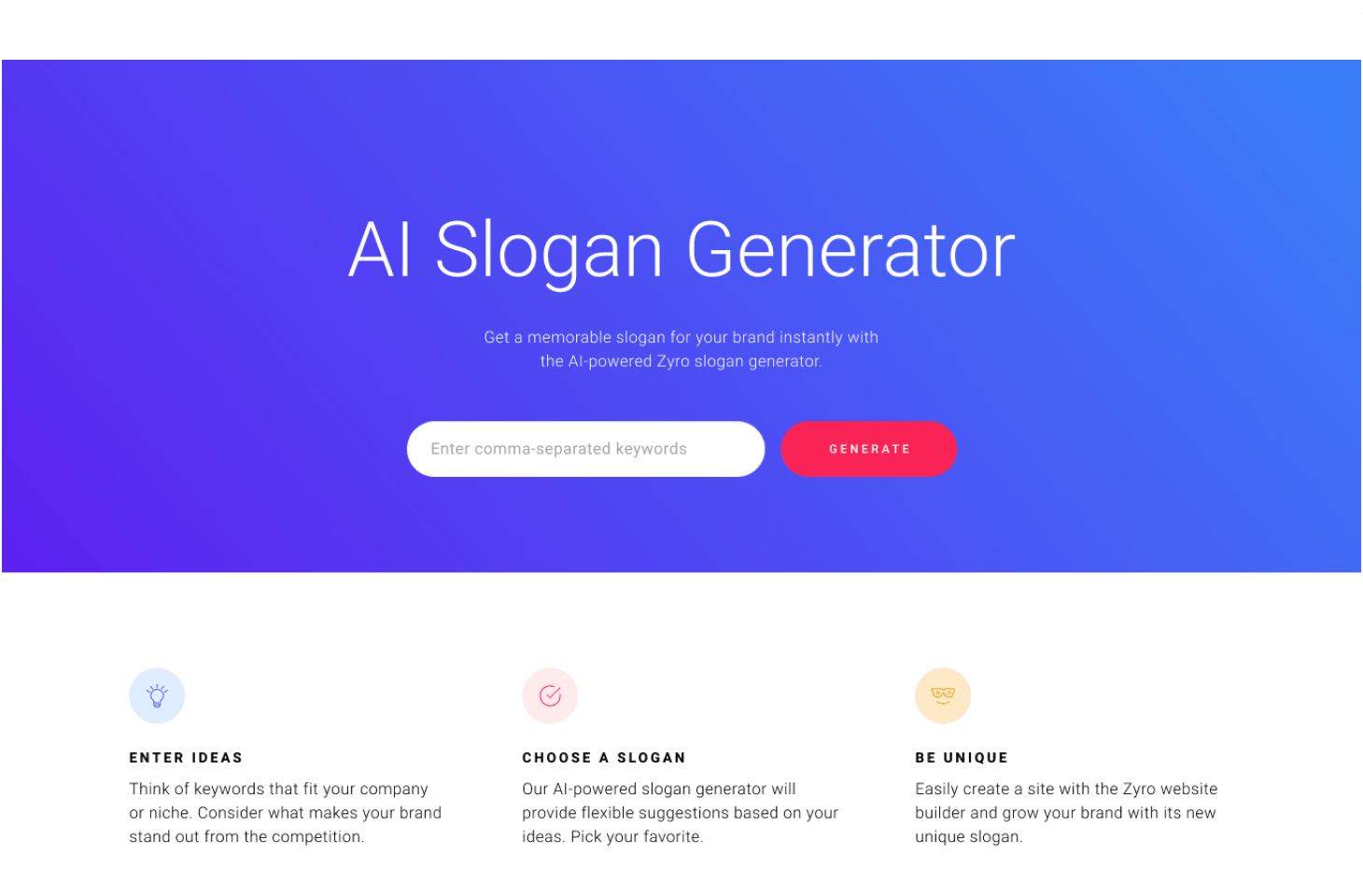
If you’re struggling to come up with one, don’t worry, we’ve got you covered. Take a look at this brilliant slogan generator: Free Slogan Generator – Generate a Catchy Slogan Easily. The tool will suggest a slogan with the help of an AI algorithm that was taught with the best practices in mind. Input related keywords and hit generate. That’s all.

Choose The Right Web Hosting
Slow speeds or your website being down can break your business. You should figure out what type of web hosting you need. After you’ve decided on what you should use, you should move onto choosing the right web hosting provider. This guide should help you get started.
Keep Your Design Consistent
Keeping your design consistent is a good way to ensure that you retain viewers. People who come to your site and have wildly different experiences from page to page will go away from your site having had a worse experience than they could’ve had. This means that that user is unlikely to come back, compared to a site that they have had a better experience on.
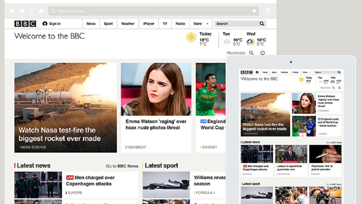
A website that gets this point across well is the BBC news website. On the homepage, the theme is immediately established: black text on a white background with some color used to highlight certain articles. Going deeper into the site, this theme is maintained, with little variation between pages. The only obvious design change is the color of the headers at the tops of articles. On sports articles, the header is yellow (which fits in with BBC Sport’s yellow-and-black aesthetic), and on news articles, the header is red. Other than that, the design is consistent from page to page.

Make It Easy To Skim Through Your Pages
In our modern, fast-paced world, people often don’t have the time or the inclination to sit back and read through every page of a given website. A good way to ensure visitors stay is to make sure that they don’t have to read through pages and pages of text to get to what they want.
Many websites fall into this trap and present their viewers with a ‘wall of text’. This means that people will leave the site, rather than take a (comparably) large amount of time to comb through an enormous block of text.
In order to stop people from doing this on your site, break up your content. Having several smaller paragraphs is a good way to make your website easier to digest, allowing people to easily scan through a couple of your pages to find the content they want. Even better, you could scatter in some images to further break up your content, which may make your work more accessible.
ThisHosting.Rocks being an example where you can find comparison tables that visitors can use instead of reading each review of a hosting provider.
Another good example of this is the Budget Bytes website. Budget Bytes is a food blogging website, which contains many different recipes. The writer of this website has realized that writing a recipe in a ‘wall of text’ fashion will lead to people avoiding their website in the future. Instead, their recipes are broken down into several small, easy to read chunks. This means that someone who is viewing a recipe can easily scroll up the webpage briefly to check a previous instruction without having to comb through a difficult to read a paragraph.
What You Should Avoid
Now that you know where to start, let’s check out some common mistakes people make when building their first website.
Don’t Use Too Many Typefaces
Once you start building your website, it’s very easy to start to use a lot of different fonts. You might choose to make a certain font the norm for most of your website, but have a certain section using a different font. This is a bad idea.
Using too many fonts in the body of your website, as well as on extraneous articles, can lead to a very messy design. Plus, there are plenty of fonts in use that people may struggle to read, especially on a brightly colored background. In general, in terms of usability and accessibility, it is best to stick to one font and keep things consistent throughout the whole of your site.
Don’t Use Too Many Colors
One bad design choice that’s all too easy to make is designing your site with too many colors. While this sounds counter-intuitive, it’s true.
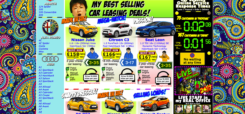
The best way to show this is by providing an extreme example, which you can see here. Ling’s Cars is a UK based car leasing company, and as such, you would expect them to have a straightforward, simple website. This isn’t the case. The Ling’s Cars website is extremely busy, with a lot of bright, flashy colors, and a wide variety of animated gifs which serve to catch the eye. An eye-catching design is certainly a respectable goal, but, as I’m sure you can see, this crosses the line and becomes an annoying website.
After a few moments of looking at it, your eyes may start to hurt from the constant motion of what’s on the screen, as well as how bright all of the colors are. This is what you want to avoid when generating your website.
If we were to redesign a few key aspects of this site to make it more accessible, there are a few places we could start. The animated logos, for example, would be sure to go. A good choice could be to change the color of the background from the current psychedelic mix and replace it with a simple color. Making even those two small changes would completely change this site, making it much more easy to stay on. Increasing the retention like this would lead to more people revisiting the site, which would lead to more cars being leased by the increased visitors.

Don’t Show Automatic Popups Too Quickly
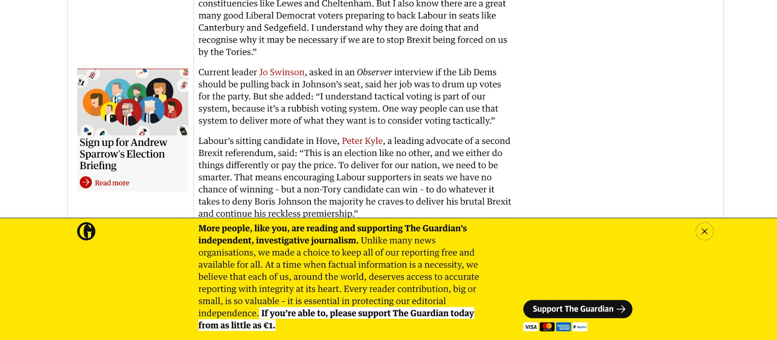
On your website, you may decide to use popups. They’re a useful tool and can make it easier for your website to be shared around the internet. However, you must make sure to not use popups too quickly on your site. An example of this being done is The Guardian website, here.
Once the website has fully loaded, all of the day’s articles pop into view. You can see any of the articles, and read them at your own pace. However, before you get the chance to do this, a popup appears at the bottom of the screen. It proclaims that The Guardian requires some funding help, and asks you to consider donating some money to help keep the site running.
While this is a noble cause, it doesn’t get clicks.
Upon seeing this popup, a huge number of the people viewing The Guardian’s website will immediately close it. A large percentage of these people may even leave the site and not return, instead choosing to get their news elsewhere. The reason for this is that popups get in the way of the content that you’re producing. On The Guardian’s website, the popup covers a large part of the bottom half of the screen, obscuring perhaps 40% of the total website. This masks articles on the website, and means that people will, almost certainly, turn away from the site.
A better way to manage popups on your site could be to only have popups emerge after someone has scrolled to a certain point on a page. For example, if a person were to scroll far enough on the page that they had certainly read the article on it, then would be a good time to have a popup appear and ask the viewer to share what they just read.

Conclusion
In conclusion, there are a lot of design choices to be made while making a website, and they’ll all affect the end product. If you make sure to follow some of the advice that we’ve laid out here, your website will catch people’s eye, and then make sure they come back for more.
This article was submitted to us by a third-party writer. The views and opinions expressed in this article are those of the author and do not reflect the views and opinions of ThisHosting.Rocks. If you want to write for ThisHosting.Rocks, go here.

